For our production we chose to follow the
conventions of a mockumentary rather than subvert the genre. We adhered to
ideas such as exaggeration and parody to ensure it would fit in with the genre.
During production we made sure our film observed conventions of continuity
quite well throughout. We made continuity quite a big point, as we all agreed
small mistakes in continuity can ruin a production, as it detracts from the
overall feel and it becomes the entire focus. There are even television shows
now dedicated to continuity mistakes, such as ‘Greatest Movie Mistakes’. For
this reason we made sure to observe the rules of continuity as best we could,
such as the 180-degree line rule in which all shots must be filmed one side of an imaginary line down the shot, to ensure characters dont swap from left to right or something similar that would confuse the viewer.

This was a particularly easy rule for us to
maintain, as our film context of a ‘nature documentary’ meant most cameras were
static and only used one or two for each location, as if they were set up and
left filming like in a nature documentary. Because of this we did not break the
180-degree rule at any point. We also ensure the sets were the same each time
we filmed which meant things such as re-arranging the room and changing bed
sheets to match what was previously filmed.
Another continuity feature made us of match
on actions to keep the video flowing between different shots and allow for the
audience to be fully submersed in the viewing experience, such as during the
scene below. In this we cut between the two shots just as the light was
switched on, as this gave us the sound of the light switch and the change in
lighting to carry over to the next shot. The light also allowed for us to make
use of graphic match editing and keep the light in the same place, adding a
more flowing feeling.


In all shots we waited for the character on
screen to move to the edge of the shot before cutting to the next, ensuring the
motion wouldn’t seem jumpy but carried over the cut to keep it continuous.
Where we did want to indicate the passing of time though, we made sure to use
fades between the scenes. This is useful as a fade to black is much like a
human eye closing when we sleep, and when it opens time has passed, like when
the shot fades back in. We used these on the scene where the student falls
asleep, as it allowed us to show how long a student can sleep for by fading
between different sleeping positions, giving the feeling of a lot of time
passing.
We also used an eyeline match in our
production, to make it so the audience understands what the student is doing
and his situation. We used this on the scene where our student is looking for
money, as it allowed us to show the audience how much money the student had
found in the pocket of some trousers.


A
slight continuity issue we had was the length of the characters hair, as at the
start of the production it is a lot shorter than the end, due to the time take
to film the final shots. This is an issue as the production is supposed to be
set during a single day, and it is a noticeable difference as the student is
the main character.
Another issue is the lighting of the scene when the student comes back home
after college. When he leaves college and the shot fades to black, it is
daylight. When he enters the door, it can be seen to be dark outside. This
isn’t as noticeable, as there was a second door with frosted glass between the
camera and the house door, but it is a slight issue. This was because filming
had to be carried out by me alone as we were approaching deadline, as no other
people in my group were available/willing to help. This meant taking a camera
home after college to film, by which point it would already be dark outside.


In these shots the difference in hair length can be
seen.
It
can clearly be seen that it is dark outside the house in this shot.
In terms of genre, we chose to try and
adhere as much to the ‘mockumentary’ genre as we could. As a mockumentary is
intended to be a comical take on either a real issue or a fictional one, there
can be different kinds of mockumentaries. We chose to do a parodical
mockumentary of a nature show, and therefore had to take in to account elements
of documentary genre as well. The first thing I felt we should do to make the
production feel like a ‘nature’ documentary is have a narrator who is for the
most part off screen. To make this fit the mockumentary element, we chose to
parody the most famous nature documentarian, David Attenborough and so named
our narrator Donvid Artenburg. Another thing I felt a lot of nature
documentaries have is vast shots of landscapes and time lapses of things such
as flowers growing and the sun coming up, much like on Planet Earth.

We tried to combine these two elements in
our title sequence and did a time lapse shot of the outside of college from the
highest floor we could reach.
Another genre convention we adhered to is
the kind of language used in the voice-overs. Rather than referring to the
character as ‘He’ or ‘Callum’, we took a more objective view and adopted the
idea of ‘let nature take is course’ as is in most nature documentaries and so
reffered to the main character as ‘The student’, making it seem like an animal.
This also adds to the mockumetary feel as it is dehumanizing the subject and
making them seem to be an animal, whilst still mentioning things that the
audience can connect with such as ‘gathering in large groups on grassy areas’
and ‘almost nocturnal’ adding the humour element of a mockumantary as the
audience can then compare to their lives and laugh at the things they do.
We also used a very ambient, relaxed guitar
track for our non-diagetic sound throughout the production to give the relaxed
nature feel, like a nature documentary would have.
One final genre convention we followed is
the semi-open narrative. Often nature programmes will show a story for a day,
leaving the narrative on a cliff hanger so the audience is enticed to come back
and see what else happens. We also did this, choosing to have a complete day in
the life of a student, but then end on the ‘DEAD LINE’ shot, so the narrative
of that day has been finished but the narrative of the life is still ongoing,
like in nature programmes.
When making our short film, we decided the
kind of audience pleasure we aimed to provide would be, according to Richard
Dyers utopian theory, ‘Community’. We feel that we achieved this to a good
degree. Whilst there may be a lack of characters in the film, which is the
first thing thought of when reading the word ‘community’ we tackled the problem
of fragmentation differently. Rather than have an extensive cast with lots of
interactions which would take time and planning to film we decided we would
show some of the classic yet slightly odd traits of a student, such as sleeping
during the day, missing deadlines, searching for money and so on. By doing
this, we show the audience, intended to be students, that they are not the only
ones who have deadlines they cant keep; who are always tired or who have little
money.

This image shows the student being ignored by a girl, a common problem for students. We highlight these problems and
make humour out of them, giving the audience a feeling of belonging as other
viewers are also likely to be in the same situation and so they are not alone
in their troubles.
There is also a slight aspect of the conquering of scarcity/abundance, as a
very poor student manages to find enough money to get food and then is quite
happy with going on in their life. This may make viewers who are lacking in
money feel better, as if someone can be happy with little money then they can
too.
In comparison to real media texts such as
Borat and Spinal Tap, the mockumentaries I looked at for inspiration, the film
fits the genre well. We followed the same structure of having a ridiculous
narrator as Borat, and having them introduce the film:
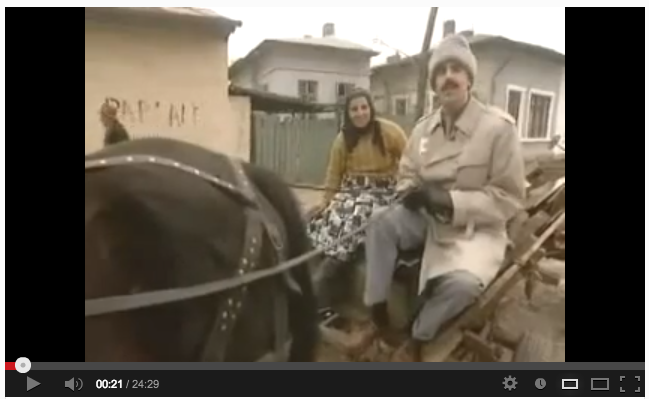
Our narrator with
a heavy Russian accent and Borat, who also has a heavy accent.
There is the element of humour with the
extended sleeping scene and the rejection by a girl, things most students will
be able to relate to, things that have been overly exaggerated to make them
stand out like the ‘turn it up to 11’ line of Spinal Tap.
We also have the elements of parody
with our narrator Donvid Artenburg and the Planet Earth-like camera shots and
voice over, much like Borat has the aspect of informative documentary with his
visiting different locations and learning about them, albeit whilst mocking
them at the same time. To do this we added a 'Rec.' effect fram to our scenes, as well as adding a blur and missing out frames to make it appear as if the camera is of a lower quality like the ones that are designed to be left waiting for animals.
.jpeg)
.jpeg)
.jpeg)
.JPG)